416-993-4953 32 Grenville Street M4Y 1A3 |
|---|
Metrobus û The Schedules
Metrobus - Overview
After I returned to Toronto I made an examination of the two dozen printed schedules I had harvested from the two Visitors Centres.
By this time, of course, I had accumulated a bit of knowledge about the layout of St JohnÆs by driving my rental car instead of taking the bus. I knew Kenmount Road in the vicinity of the Enterprise Car Rental Agency. I knew Signal Hill and the area on the highway coming in from Bay Bulls, and so to a limited extent some of the maps made sense to me. But they made no sense to me on the Friday night before my planned Monday-Tuesday tour by Metrobus.
In the notes below I have numbered my comments from one to thirty. I stopped at thirty because by then my numbered comments had the same value as the bus route I was examining (ô30ö).
I have tried to provide at least one route pamphlet that is an example of my comments. Note that this is but ONE example. Examples can be found on most schedules.If I get around to it, I will provide a cross-reference table matching route pamphlets against comments. That will, of course, be something like a 30x24 element table.
(0) Offer the Map to the Public
Above all, offer the full map to the public. At cost, if you must, or monies collected go to a charity. I cannot see the reasoning behind printing full-system maps and then not making them available to the public.
(1)áGrey and Ochre
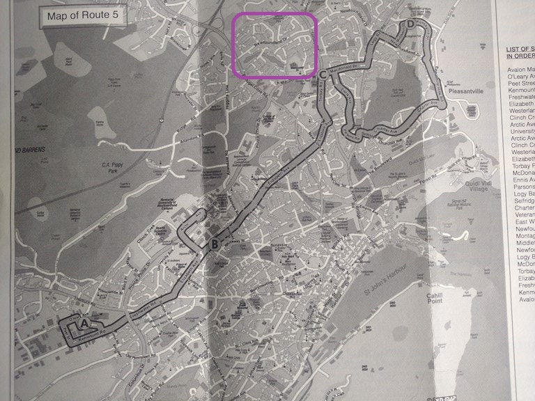
(Schedule 5) The schedule maps are printed in grey-scale (ôblack and whiteö) on a yellow-ochre paper. This is not a good combination for reading. Web pages that are dark red lettering on a dark blue background are worse. But grey-scale on an ochre background cannot be said to be good when you are trying to read the map in a moving bus or on a breezy street in St JohnÆs in early autumn.
Be honest now: In the purple-circled area, can you read any street name apart from ôNewfoundland Drö? If not, why waste ink on illegible names?
(2)áDifferent Layouts
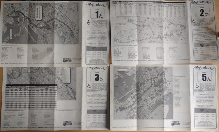
(Schedules 1,2,3 and 5) The schedules have widely different layouts. See for example the layouts for routes 1, 2 and 3, the first three printed schedules.

(Schedules 16,18) Schedule 18 decides not to show the map on the regular (face) side.
(3)áOrientation of the Maps
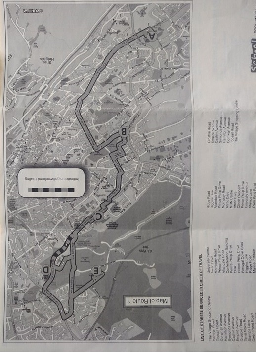
(Schedule 1) No orientation of the maps is given. Not even a ôNorthö arrow. I would have gained knowledge from a secondary directional arrow pointing to ôDowntownö
(4)áStreets Without Checkpoint Letters
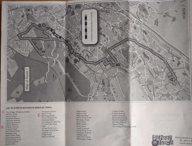
(Schedule 1) Each schedule bears a ôlist of streets in service orderö. I would have benefited from the checkpoint letters ôAö, ôBö, ôEö etc being placed alongside the appropriate streets in the list.
In the modified image above I have inserted the checkpoint letters ôAö, ôBö and ôCö in purple.
(5)áIncomprehensible Text
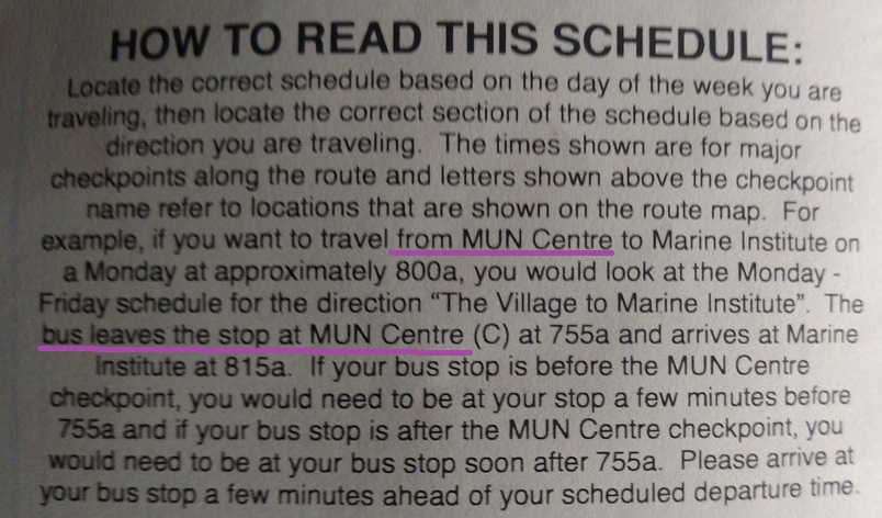
(Schedule 1) In many cases the accompanying text is incomprehensible to the newcomer. ôThe bus leaves the MUN centre ...ö but what/where is the MUN centre? Is it downtown? Is it the central dispersion point for buses? Better would be some linkage between checkpoint letters and the terms, for example ôcheckpoint Cö is also known as ôThe MUN Centreö. Or use one form or the other, but not both.
If you want to argue that I should have at least a minimal understanding of the layout of the city, I agree with you. ThatÆs why a hard-copy system map would be useful to newcomers.
(6)áSmall Fonts
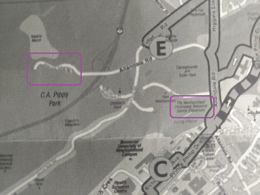
(Schedule 1) The fonts are too small. Look at the street name running west from Allendale. Look at the institute near Long Pond. As an outsider, can you read those names? (I have the same problem with TorontoÆs PATH map, printed on an A4-sheet. The 24-year-old clerks in the hotel canÆt read it with their excellent vision and lighting. How can I?)
(7)ám-Card Sales Outlets

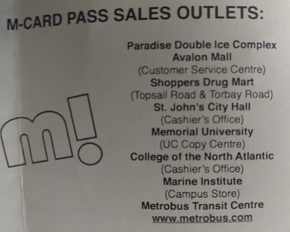
(Schedule 1) There are listed only seven M-Card sales outlets. So. Mark them on the maps to make it easy for us to hop off and top up.
A simple icon in a legend, maybe the dollar symbol to indicate where you can exchange money for travel.
Please donÆt ask me what the ôm!ö is doing there. It appears to be a useless symbol. I could be wrong. Wasted space. Clutter. Take your pick.
(8)áReducing Balance
Since I did not ride a bus, I donÆt know whether the reducing balance is shown on the devices. The Toronto Transit Commission in Toronto is particularly devious in this regard. Tap your Presto card and the balance is NOT shown. On every other system on which IÆve used my Presto card (e.g. GO Transit) the new balance is shown)
(9)áConsistent Checkpoints
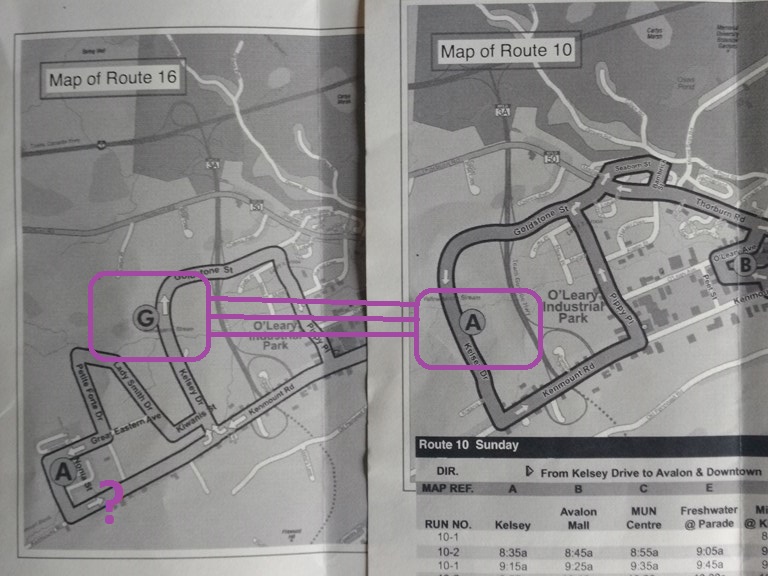
(Schedules 10,16) Checkpoint A is serviced every 30 minutes by route 10; Checkpoint G is serviced every 60 minutes by route 16. Why not use the same checkpoint letter for a location, so that we readily associate (say) ôGö with the Metrobus centre, ôAö with the MUN centre, and so on.
(10)áAccessible Routes
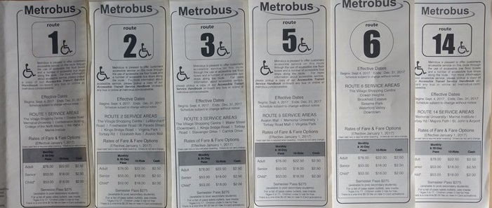
Of the twenty routes covered by my set of schedules only five routes (1, 2, 3, 5, 14) are ôAccessible routesö, while fifteen routes (6, 9, 10, 11, 13, 15, 16, 18, 19, 21, 22, 23, 24, 26, 30) are inaccessible. I like to think that this is a work-in-progress, as is the Toronto Transit CommissionÆs efforts to make subway trains accessible, a process which should be complete by the year 2035.
(11)áBike-Racks
I see no mention of bike-racks on buses. Given the hilly nature of St JohnÆs this might be a good thing. That said, the infrequency of buses (typically once ever 60 minutes) lends itself to the thought that the fastest way to get to work would be to cycle to a bus route, and at the end of my trip cycle to work. This is sometimes called ôThe last mileö approach.
(12)áConnecting Routes
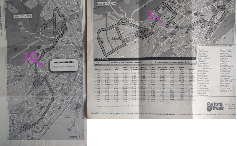
(Schedules 1, 10) Show Connecting routes. For example, where one route intersects with another, show a line with the crossing route number(s) listed. This makes it easier for travelers to anticipate a need to descend.
I have tried to indicate a line crossing a route with the number of that crossing route. On the route map image, route 10 crosses, and of course, on the route 10 image route 1 crosses.
You get the idea. Change buses here!ö
(13)áIdentify Major Routes
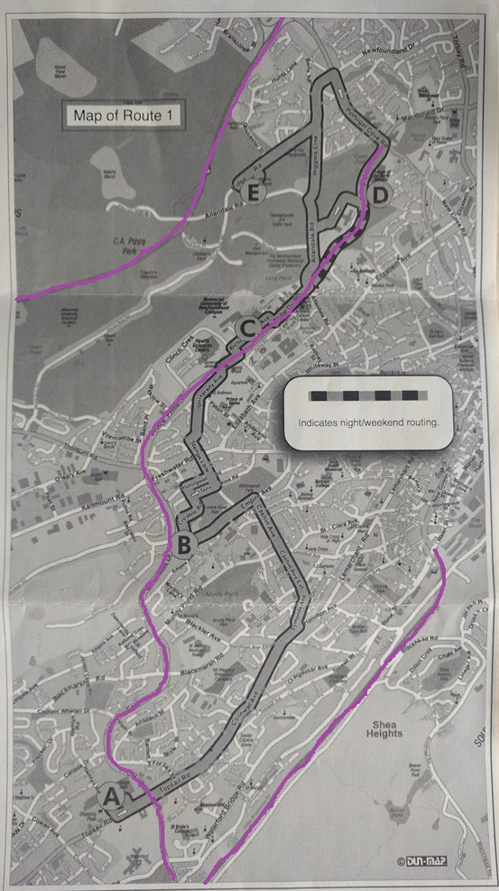
(Schedule 1) Identify (say) ten major landmark routes. Examples are ôHighway 2 coming in from Conception Bay Southö, ôThe Trans-Canada Highwayö, ôBay Bulls Roadö.
My real knowledge of St JohnÆs city is limited, but I have highlighted The Highway #2 which arrives from Conception Bay South and delivers us to the doorstep of downtown, Columbus/Prince Phillip which seemed to me to be a broad arterial road, and of course the Trans-Canada Highway.
These three roads provide a skeleton or structure for the region shown in the map.
It should be possible to identify no more than ten such roads that will show common links between the individual schedule maps.
(14)áRun-Number
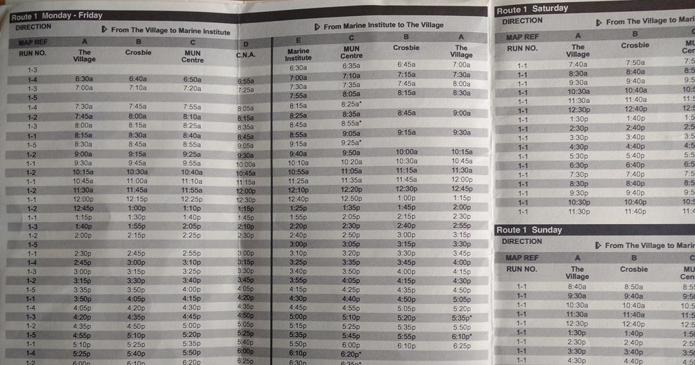
(Schedule 1) Why print the run-number on the schedules? No explanation is given of its value to the traveler.
I deduce that the run-number identifies the physical bus (and hence a physical driver on that run).
Up to five vehicles are at work on Route 1 on weekdays, but only one vehicle is in operation on weekends.
As a passenger I donÆt care at all about this data. It cannot be processed to yield information.
ItÆs a bus, OK? Did it pick me up on time? Did it drop me off on time? ThatÆs all I need to know.
If I left my hat and gloves on the bus, well, it was TuesdayÆs 9:30áa.m. from The Village. You work it out.
(15)áIdentify the Downtown Core
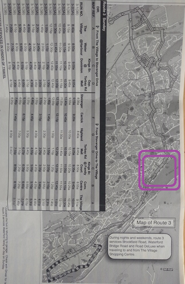
(Schedule 3) Identify the downtown core (Water and Duckworth streets) with a bold rectangular line to help travelers to locate the business district.
I have done my best with two concentric circles in purple. But you get the idea.
(16)áMap Scale
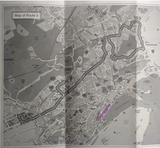
(Schedule 5) There is no scale on maps. With buses running every 60 minutes, IÆd like to know whether it makes sense to wait for a connecting bus, or to walk. A scale showing five-hundred metres suits me. That is an easy distance for most people, weather permitting.
I havenÆt drawn a real scale, but I have outlined a twenty-minute walk across the business district to give you some idea of the scale of this map.
Do you see how consistent highlighting of the business district might be an advantage to travelers?
(17)áHighlight Major Hubs
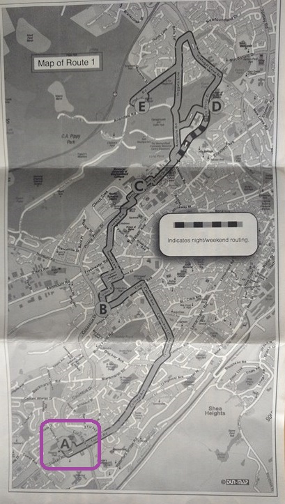
(Schedule 1) Highlight major hubs such as Avalon Mall. A major hub might be defined as any place where three or more routes congregate.
For example ôVillage Mallö as it is called on the full-size printed system map, available only to employees of Metrobus, is host to eleven routes: 1, 2, 3, 6, 13, 12, 18, 19, 21, 22 and 25. And no, I donÆt know why they are not listed in ascending sequence.
The same location is of course known as ôcheckpoint Aö on the map itself. YouÆd never know that it was a good place to catch a bus, unless IÆd told you, would you?
And also No, I donÆt know why the hub is called ôThe Village Shopping Centreö in the list of streets on the schedule for route 1.
(18)áWasted Space
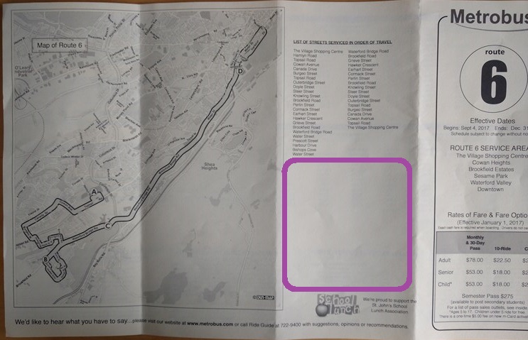
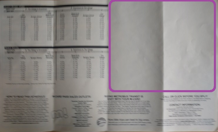
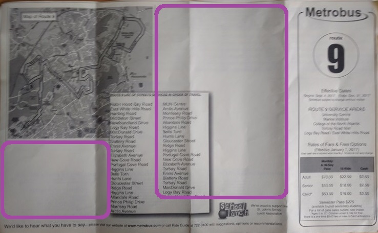
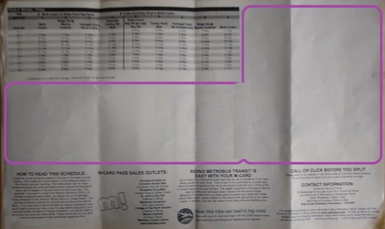
(Schedules 6, 9) there is too much unused space on some schedules. Make the maps bigger with readable font and with identical scales (ôTwo hundred metres to the Inchö) OR dedicate the space to a macro view of this route on the (micro) full system map.
(19)áObliterated Map Areas
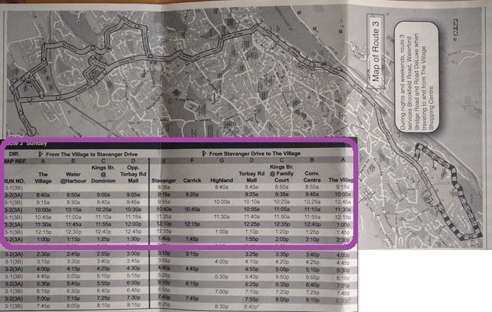
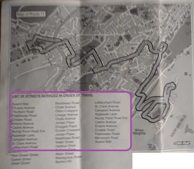
(Schedule 3, 11) With map space and legibility at a premium, text notes should not be hiding parts of the map. Those hidden parts could be showing convenient connecting routes.
Of course, without a map scale it is difficult to tell whether the area of map obliterated by the text would be walkable or not.
(20)áMicro Full System Map
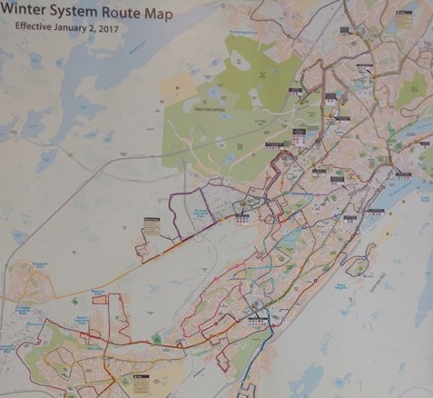
Provide a micro version of the full system map on each schedule, with all twenty routes clearly marked and perhaps the intersecting points given unique Checkpoint labels. (ôOh, I see. I ride route 1 to checkpoint H and then switch to route 2. Got it!ö)
My crude reproduction of a photograph of the printed map that you can look-but-donÆt-touch in the Metrobus Centre out in the country shows you, at this reduction, the broad lines that represent the thirty bus routes stand out.
It would be nice if each micro-map was customized to the route schedule. ShouldnÆt be difficult with Google Maps Directions or similar.
(21)áHalf-Used Space
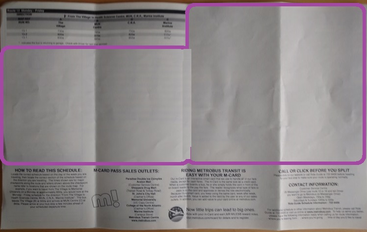
(schedule 13) Only a half of the area is used. What a waste of opportunity.
(22)áUnreadable Street Names
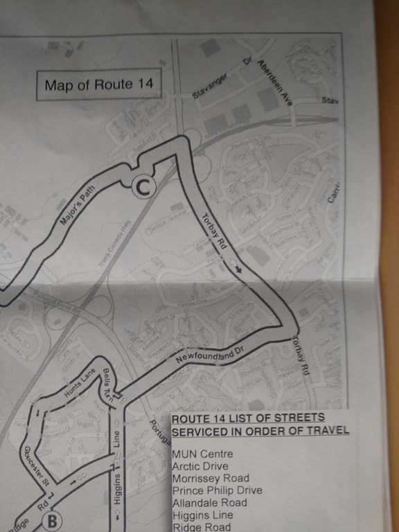
(schedule 14) Pale grey on pale grey or ochre is taboo. The map is nominally large-scale, but even with my reading glasses and a 150-watt lamp bulb I canÆt read the street names. There is no point in devoting resources to schedules or maps that canÆt be read.
(23)áAirport Shuttle
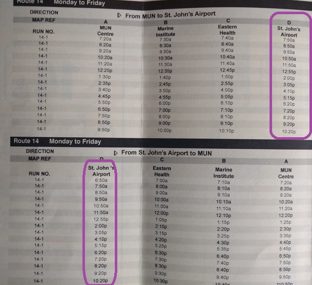
(schedule 14) Service to the airport is only every sixty minutes? Come on. I know it isnÆt Toronto, but it is an International airport, with flights to London UK amongst other places, and Newfoundland is an island, so to do business you have to fly here. Every sixty minutes to a connecting bus (that also runs every sixty minutes)?
Give us a fifteen-minute shuttle from the airport with a knowledgeable driver who can respond to the question ôWhat route do I connect to to get to Kenmount Road/Avalon Mall?ö
If the driverÆs job is to drive, hire a conductor who will keep track of which visitor needs to go where, and also makes sure that they know how to use a transfer ticket, and so on. Maybe even keeps a secret stash of schedules in his lunch box. Maybe even offers printed full-colour system maps for sale, all proceeds to the ground staff benevolent fund. Be imaginative!
I thought about this over a cup of tea this morning. I canÆt think of an International Airport IÆve been through (landed at or taken off from) that is serviced only once an hour by public transit.
Even TorontoÆs badly-designed UPX train is every fifteen minutes. It is, however, as bad as St JohnÆs in that it limps to a nearby hub and then dies there.
(24)á Trivial Routes
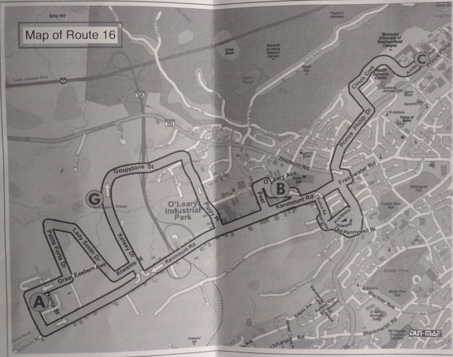
(Schedule 16) Some routes are too trivial to be called routes. Wherever possible combine two or more routes to make a single continuous route. Pool the buses on that route.
I admit to being way out of my depth here. I ***think*** that this map represents only a teeny portion of the city of St JohnÆs. It looks more like a local shuttle service than anything and, of course, I canÆt tell by looking at this map whether it connects to any useful service in the MUN centre.
It appears to run from the western end of the city (near but not to Metrobus headquarters) to the MUN centre.
The airport bus, route 14, comes to the MUN centre too.
Why not combine the two routes so that the sixteen-fourteen route spans from the airport to the west end. No need to change buses. This combined route becomes a spine that intersects with many north-south routes.
(25)áMap Orientation
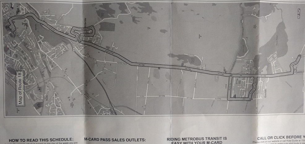
(Schedule 18) Orientation! It took me a while to work out this route, and yet I know this road. I drove it several times. How can I become lost when reading a map of a district I already know?
The map image is presented as it appears in the schedule paper. I was driving in from Bay Bulls, way down to the south. Which is the right-hand side of this map.
Route 18 of course only goes as far as Avalon Mall, so if you want to head downtown, you drive your car from Bay Bulls to some spot just south of Goulds, then catch the route 18 to Avalon Mall. You hop off your #18 and hope that the #3 or #6 havenÆt left without you. These routes all operate at half-past the hour every 60 minutes at Village Mall, so unless Metrobus is as brilliant as Peterborough you could have a long wait.
Next time drive all the way into town, OK?
Again, I have a feeling that combining Routes 18 and 6, say, would make more sense than keeping them separate.
Fewer schedules to print, for example, and with the money saved you could print more of those full system maps to help newcomers get to know the buses.
(26)áCircular Shuttle
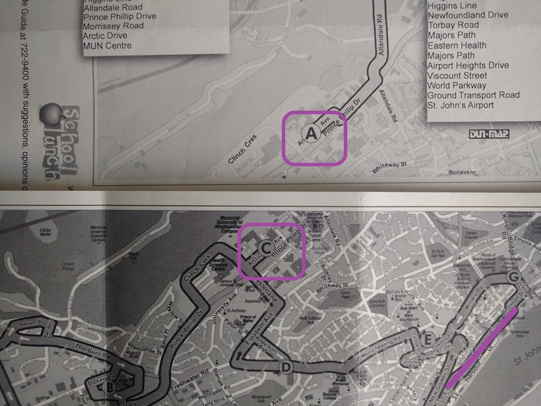
I believe that one walks across the downtown core to connect to their buses. The airport to Avalon mall involves a walk to/from the MUN centre. Why not have a circular shuttle that ties together all routes that radiate from or pass though the downtown core?
I have a memory of telephoning Metrobus to confirm a bus route from the airport to Kenmount Road (almost), being routes 14 (from the airport to MUN) and 10 (from MUN to Avalon Mall), and that there was a short walk between connecting buses. Maybe it was a short walk from the Avalon mall to the car rental.
I believe that checkpoints ôAö and ôCö are the same place, or at least quite close.
There seems to be a hodge-podge of bus routes that try to get close to the downtown core. A ôring-roadö type of route connecting to mini-buses, not much larger than cars, should then avoid having large buses travel through the downtown core AND provide a convenient connection to routes that circulate around the ring.
(26)áFully-Funded Circular Shuttle
Make the circular shuttle a fully-funded loop that ties together all routes that radiate from or pass though the downtown core? Riders can tour the short downtown strip with ease, hop on, hop off, and connecting passengers donÆt have to flub about retrieving their transfer pass.
There is no such thing as ôFree Public Transitö, someone pays, somewhere, some time. But a fully-funded downtown shuttle means quick entry for passengers, and that means a speedier time around downtown, and less obstruction time for those oh-so-impatient car drivers.
(27)áKeep it Simple
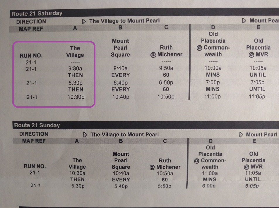
(Schedules 21, 22) The text/fonts are conflicting and confusing me. Why repeat ôThen Every 60ö (clearly typed into a spreadsheet format!)? Why not put simple ô9:30áa.m to 10:30áp.m. every 60 minutesö, or ôOn the half-hour every 60 minutesö? keep it simple, and understandable. Peterborough (Ontario) has the most brilliant schedule system I have ever met. It is logically and physically impossible to miss your connection, and so you can never be late for an appointment with anyone anywhere in the city.
I really donÆt get this at all. There is only one vehicle (ôRun No. 21-1ö) and from 9:30áa.m. until 10:30áp.m. it leaves at half-past the hour. Why the extra lines of text?
(28)áReduce Useless Text
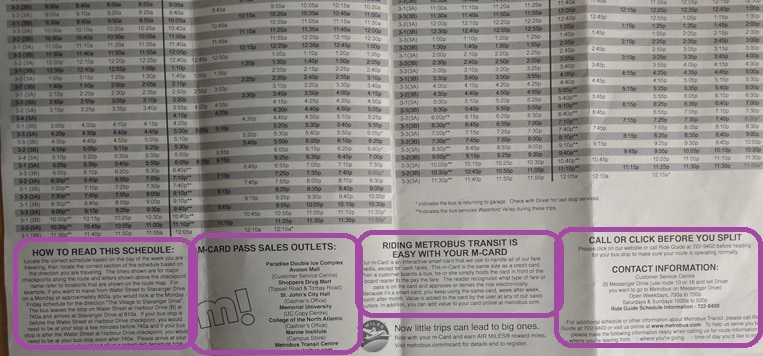
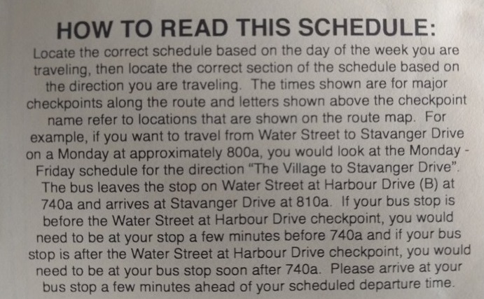
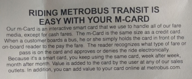
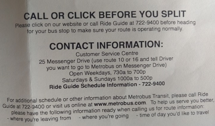
Reduce useless text and increase useful data by putting all general information (ôHave your fare ready, be at the stop a little earlyö) on a single General information sheet, and use the space on the schedule sheets to better advantage.
There are very few fully-funded transit systems in the world (sigh!). We all know we have to pay fares, give the driver advanced warning of a stop, sit near the front if we have asked the driver to alert us, and so on. DonÆt we?
(29)áUse Resources Wisely
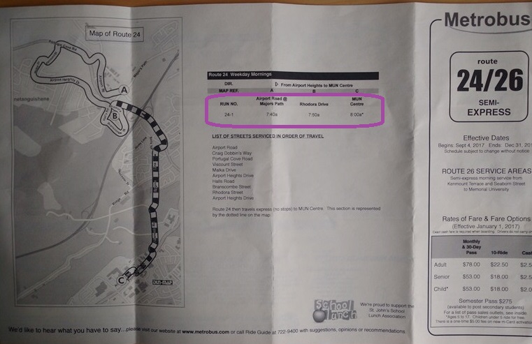
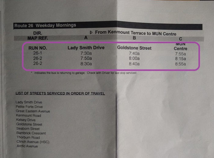
(Schedule 24, 26) One sheet for only four bus runs? Come on! Schedule 30 uses one sheet for only eight bus runs. Use resources wisely (and put the saved resources into providing full-colour full-size system maps for new users of the system)
(30)áUse the Checkpoint Letters
(Schedule 30)
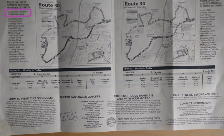
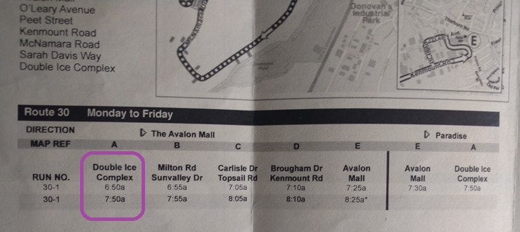
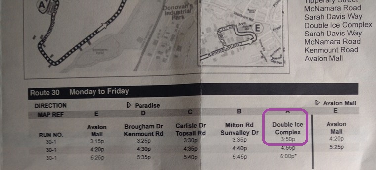
Use the checkpoint letters (A, C, E, etc) on the list of streets. Where the heck is Double Ice Complex?
 Circular Shuttle.png)
Loading
416-993-4953 CPRGreaves@gmail.com
Toronto, Wednesday, December 12, 2018 11:35 AM
Copyright ® 1996-2018 Chris Greaves. All Rights Reserved.